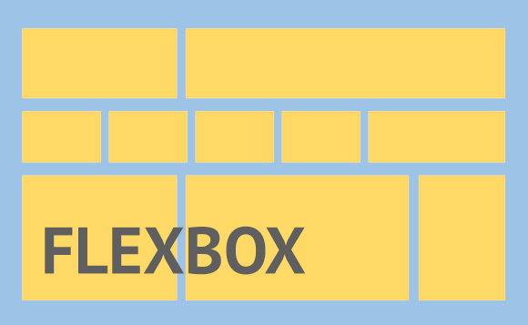
There are different approaches to creating responsive web pages. One approach is called mobile first. When designing mobile first, you focus on sketching and prototyping the smallest screen first and work your way up to desktop designs. In mobile first design, the focus is in designing for a phone, then tablets, then desktop computers. In reality, we design for any screen size along the way.
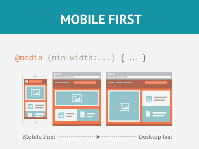
Media queries are a fairly new technology in Web Page Design. They were introduced with CSS3. With media queries, you can create different layouts based on the size of the viewport (browser window). Media queries only apply styles when certain conditions are met. Normally the conditions are the minimum or maximum width of the viewport.

Since we are designing for multiple screen sizes, it is a good idea to provide images based on the size of the viewport. We can easily use the width or max-width property to make an image responsive based on the size of the viewport. In addition, we can now use the new picture element to load different images based on the size of the viewport.
Responsive typography adjusts the font size of your text based on the size of the viewport. Phones and tables have smaller viewports and therefore should, in many cases, have smaller font sizes. We will use the rem unit to create relative font-sizes based on viewport size.
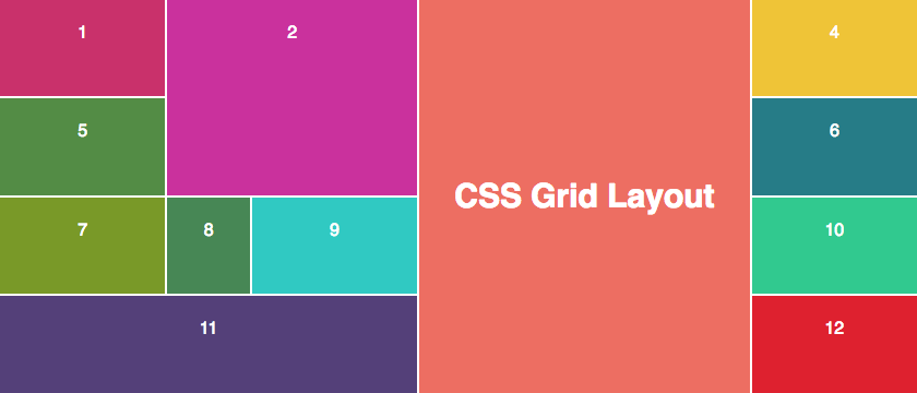
CSS Grid is a two-dimensional layout system for creating web pages. It allows you to specify the number of columns and rows in your design. More importantly it is well suited for responsive design because it automatically adapts to the size of the viewport. When combined with media queries, it is a powerful and efficient way to create responsive designs.
